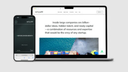
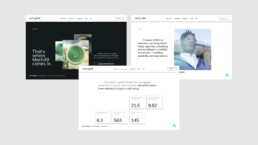
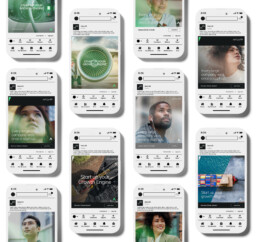
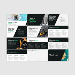
The Mach49 brand team challenged me to create a visual language that reflects and communicates their idiosyncratic, unapologetic, rationally exuberant, and vital organization.
VENTURE DRIVEN GROWTH
The solution was to express the idea of VENTURE DRIVEN GROWTH simply provocatively and repeatedly.
A Modern Shift Up
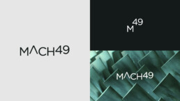
To give the brand a modern design that was simple, bold, and able to grow—A Simple Shift in Sophistication. The design system shifts the perspective of Mach49 and its communications to be clear and apologetically bold.
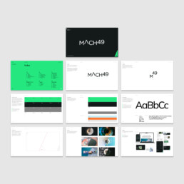
Brand Guide
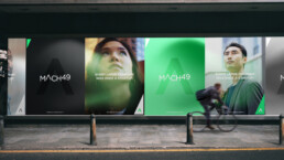
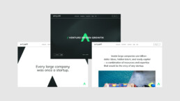
The competition lives in blue. So, we wanted to shift the brand’s perspective and go green. Because Green means go. But it also rationally represents Growth. So, I developed a brand and color system that was simple yet modern.
The From to Shift
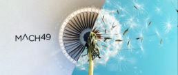
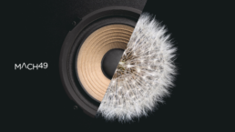
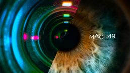
To articulate change, transformation, and opportunity, I developed the SPLIT device to visualize how and who it’s for.
A Shift in Possibilities
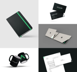
In support of the Brand refresh, I designed everything from the Brand Guide, to every piece of brand collateral: Websites, Keynote, PowerPoint, and Google Slide brand presentation templates, letterhead, one-sheets, proposal templates, mugs, laptop stickers, social templates, Canva templates, and more.
