Working to Differentiate
We were fortunate to have the opportunity to create a new brand identity for EverWorker. This project involved not only renaming Integrail but also addressing the challenge of making a significant shift in the industry. By partnering with Hi It’s Us, our goal was to develop a brand that stands out in the visually crowded and thematically repetitive landscape of AI and SaaS brands.
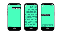
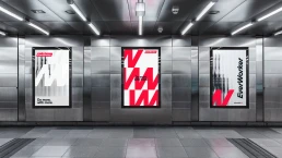
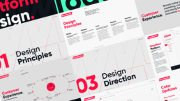
Building Consistency
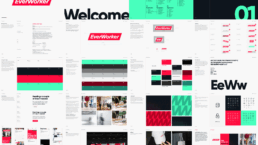
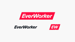
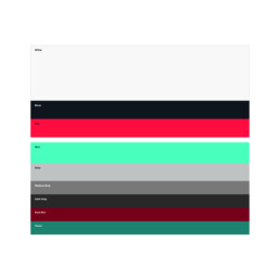
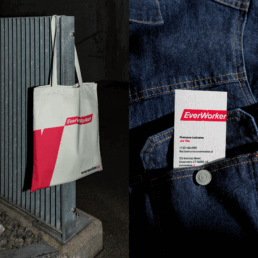
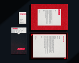
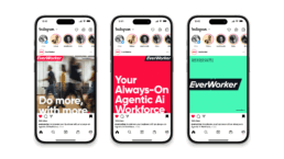
The EverWorker brand guide is vital for ensuring consistency and clarity across all touchpoints. It details essential elements, such as logo usage, color palette, typography, and photographic style, making EverWorker’s identity easily recognizable and cohesive. Balancing strict guidelines with creative flexibility, the guide empowers teams and partners to represent the brand while authentically upholding its core principles. More than just a document, it serves as a strategic resource that reinforces EverWorker’s mission, visual identity, and tone in every interaction, from digital products to print materials.

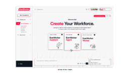
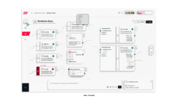
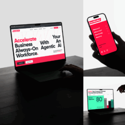
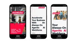
A Website That Works

Workers-First Platform
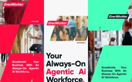
The strength and clarity of the EverWorker brand design created the opportunity to extend that work into the AI platform itself, ensuring the product experience and the brand are built from the same strategic foundation. This continuity lets the platform embody EverWorker’s transformative, collaborative, and trustworthy positioning in every interaction, not just in marketing.
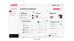
The EverWorker Design Platform applies a workers-first strategy, using simple, minimal, and trustworthy patterns to keep customers focused on building and managing EverWorkers without distraction. Key journey moments like onboarding, in-flow creation, and success states are intentionally simplified with clear next steps, plain-language settings such as “Creativity,” instead of tech-focused jargon like “Temperature,” and single, prominent calls to action like “Employ Your EverWorker,” turning the brand principles into concrete product behaviors.